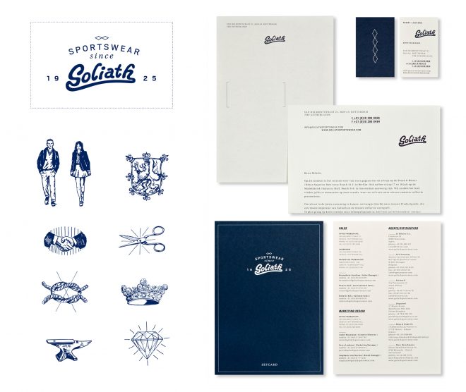
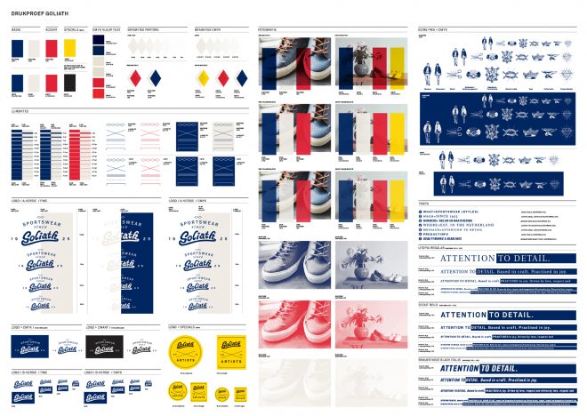
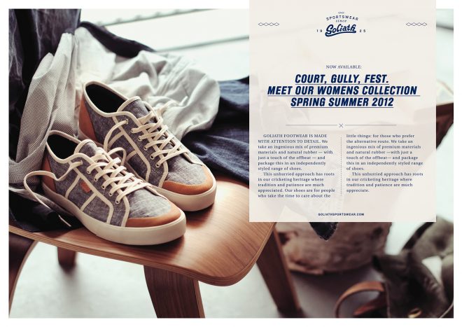
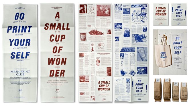
When studying the original heritage and qualities of the Dutch cricket brand Goliath Sportswear, we discovered a love for design, a passion for detail and extensive understanding of materials. We used these aspects to revive Goliath and strengthen its position in today’s competitive retail world. Originality, heritage and attention to detail are now the guiding principles for the brand – from the first design to the very last stitch.
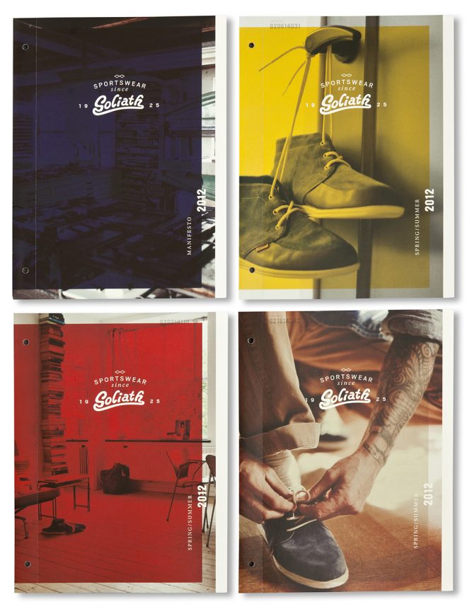
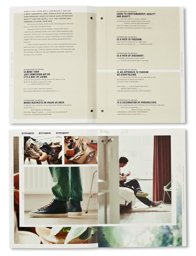
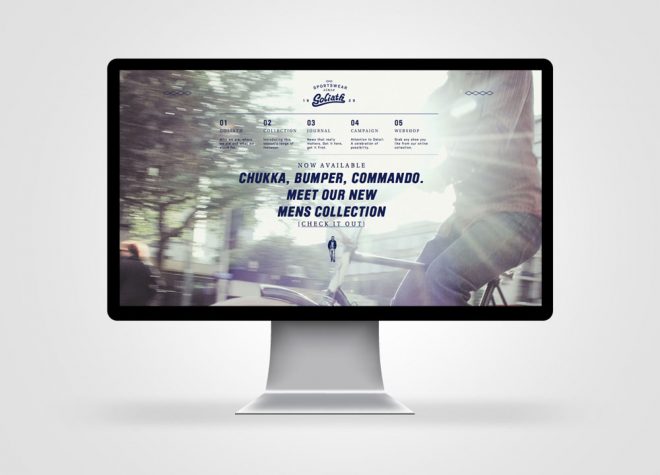
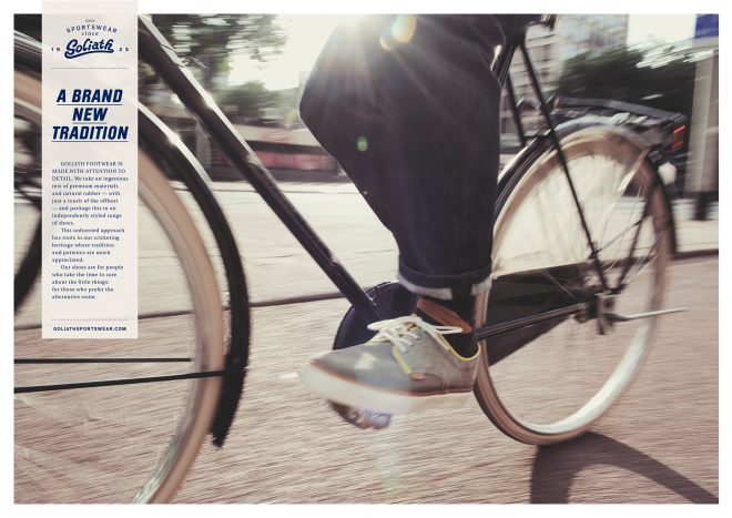
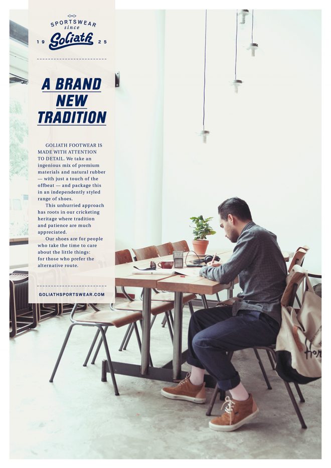
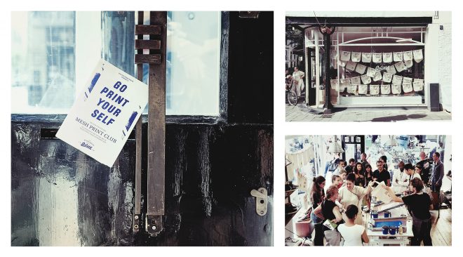
Together with graphic design agency Studio Beige, we used the original Goliath logo as a starting point and built around that. We used characteristic elements of the past– such as the cricketing symbols– as inspiration for the design direction. This is now implemented throughout the whole brand; from ads to shoes to stores. I developed a consistent artisitic direction for the advertising, lookbook and product photography– using natural lighting, original settings and interesting angles to highlight product features. Using the elements of the design– and photographic direction, we created a new website, webstore and numorous social media applications and campaigns, communicating the new brand direction. Under the umbrella of our Attention to Detail campaign and our search for others who share our passion for the beautiful and well made, we teamed up with local communities and held various events and workshops in cities around Europe.
Graphic Design by Studio Beige
Photography by Jan Bijl
